Table of Contents
Introduction to HTML Templates
HTML templates are pre-designed, reusable code structures that serve as starting points for building websites and web applications. They save development time by providing ready-made solutions for common design patterns and components. Templates range from simple elements like navigation bars and footers to complete page layouts and complex UI components.
Well-designed HTML templates follow best practices for semantics, accessibility, and responsive design. They provide a solid foundation that can be customized to match your specific requirements while maintaining code quality and consistency.
In this comprehensive guide, we'll explore various HTML templates for common website components and layouts. Each template is designed to be:
- Semantic - Using appropriate HTML5 elements to convey meaning
- Accessible - Following WCAG guidelines for inclusivity
- Responsive - Adapting to different screen sizes
- Customizable - Easy to modify and extend
- Well-documented - Including comments explaining key aspects
How to Use These Templates
Each template can be copied and used as a starting point for your own projects. To customize:
- Copy the HTML code using the "Copy" button
- Paste into your HTML file
- Replace placeholder text and images
- Modify classes and IDs as needed
- Adjust the CSS to match your design requirements
For a complete working example, you'll need to include the CSS styles mentioned in each template.
Basic Page Layouts
The foundation of any website begins with a solid page layout. Here are several HTML templates for common page structures that provide a starting point for your projects.
Single-Column Layout
A clean, centered single-column layout ideal for blogs, articles, and content-focused pages.
<!DOCTYPE html>
<html lang="en">
<head>
    <meta charset="UTF-8">
    <meta name="viewport" content="width=device-width, initial-scale=1.0">
    <title>Single-Column Layout</title>
    <style>
        /* Basic styles for demonstration */
        body {
            font-family: Arial, sans-serif;
            line-height: 1.6;
            color: #333;
            margin: 0;
            padding: 0;
        }
        .container {
            width: 100%;
            max-width: 800px;
            margin: 0 auto;
            padding: 0 20px;
        }
        header {
            padding: 20px 0;
            border-bottom: 1px solid #eee;
        }
        main {
            padding: 20px 0;
        }
        footer {
            padding: 20px 0;
            border-top: 1px solid #eee;
            text-align: center;
            font-size: 0.9em;
        }
    </style>
</head>
<body>
    <header>
        <div class="container">
            <h1>Site Title</h1>
            <nav>
                <ul>
                    <li><a href="#">Home</a></li>
                    <li><a href="#">About</a></li>
                    <li><a href="#">Services</a></li>
                    <li><a href="#">Contact</a></li>
                </ul>
            </nav>
        </div>
    </header>

    <main>
        <div class="container">
            <article>
                <h2>Main Content Heading</h2>
                <p>Lorem ipsum dolor sit amet, consectetur adipiscing elit. Vivamus lacinia odio vitae vestibulum vestibulum. Cras porttitor metus justo, vitae fringilla purus gravida non.</p>

                <h3>Subheading</h3>
                <p>Pellentesque habitant morbi tristique senectus et netus et malesuada fames ac turpis egestas. Duis efficitur sem sed dui imperdiet, nec ultricies sapien finibus.</p>

                <h3>Another Subheading</h3>
                <p>Fusce tincidunt est non libero ultrices, eu finibus nulla efficitur. Praesent pellentesque quam id tortor condimentum, id tincidunt nibh finibus.</p>
            </article>
        </div>
    </main>

    <footer>
        <div class="container">
            <p>© 2023 Your Website. All rights reserved.</p>
        </div>
    </footer>
</body>
</html>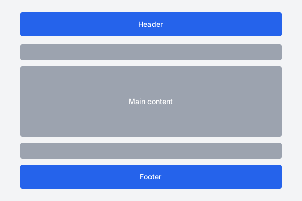
Features:
- Clean, centered content container
- Responsive design with max-width
- Semantic HTML5 structure
- Simple navigation menu
- Clear content hierarchy
Two-Column Layout with Sidebar
A versatile two-column layout with a main content area and a sidebar, ideal for blogs, documentation sites, and content-rich websites.
<!DOCTYPE html>
<html lang="en">
<head>
    <meta charset="UTF-8">
    <meta name="viewport" content="width=device-width, initial-scale=1.0">
    <title>Two-Column Layout with Sidebar</title>
    <style>
        /* Basic styles for demonstration */
        body {
            font-family: Arial, sans-serif;
            line-height: 1.6;
            color: #333;
            margin: 0;
            padding: 0;
        }
        .container {
            width: 100%;
            max-width: 1200px;
            margin: 0 auto;
            padding: 0 20px;
        }
        header {
            padding: 20px 0;
            border-bottom: 1px solid #eee;
        }
        .content-wrapper {
            display: flex;
            flex-wrap: wrap;
            gap: 40px;
            padding: 40px 0;
        }
        main {
            flex: 1;
            min-width: 0;
        }
        aside {
            width: 300px;
        }
        .sidebar-widget {
            margin-bottom: 30px;
            padding: 20px;
            background: #f8f8f8;
            border-radius: 5px;
        }
        footer {
            padding: 20px 0;
            border-top: 1px solid #eee;
            text-align: center;
            font-size: 0.9em;
        }

        /* Responsive adjustments */
        @media (max-width: 768px) {
            .content-wrapper {
                flex-direction: column;
            }
            aside {
                width: 100%;
            }
        }
    </style>
</head>
<body>
    <header>
        <div class="container">
            <h1>Site Title</h1>
            <nav>
                <ul>
                    <li><a href="#">Home</a></li>
                    <li><a href="#">About</a></li>
                    <li><a href="#">Services</a></li>
                    <li><a href="#">Contact</a></li>
                </ul>
            </nav>
        </div>
    </header>

    <div class="container">
        <div class="content-wrapper">
            <main>
                <article>
                    <h2>Main Content Heading</h2>
                    <p>Lorem ipsum dolor sit amet, consectetur adipiscing elit. Vivamus lacinia odio vitae vestibulum vestibulum. Cras porttitor metus justo, vitae fringilla purus gravida non.</p>

                    <h3>Subheading</h3>
                    <p>Pellentesque habitant morbi tristique senectus et netus et malesuada fames ac turpis egestas. Duis efficitur sem sed dui imperdiet, nec ultricies sapien finibus.</p>

                    <h3>Another Subheading</h3>
                    <p>Fusce tincidunt est non libero ultrices, eu finibus nulla efficitur. Praesent pellentesque quam id tortor condimentum, id tincidunt nibh finibus.</p>
                </article>
            </main>

            <aside>
                <div class="sidebar-widget">
                    <h3>About</h3>
                    <p>Short description about the website or the author.</p>
                </div>

                <div class="sidebar-widget">
                    <h3>Categories</h3>
                    <ul>
                        <li><a href="#">Category 1</a></li>
                        <li><a href="#">Category 2</a></li>
                        <li><a href="#">Category 3</a></li>
                        <li><a href="#">Category 4</a></li>
                    </ul>
                </div>

                <div class="sidebar-widget">
                    <h3>Recent Posts</h3>
                    <ul>
                        <li><a href="#">Post Title 1</a></li>
                        <li><a href="#">Post Title 2</a></li>
                        <li><a href="#">Post Title 3</a></li>
                    </ul>
                </div>
            </aside>
        </div>
    </div>

    <footer>
        <div class="container">
            <p>© 2023 Your Website. All rights reserved.</p>
        </div>
    </footer>
</body>
</html>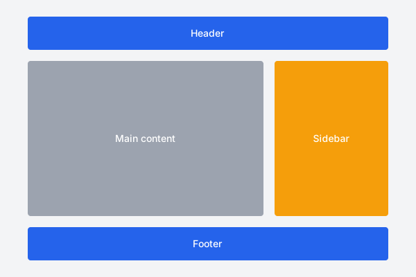
Features:
- Flexible two-column layout using flexbox
- Responsive design that stacks on mobile
- Sidebar widgets for additional content
- Semantic HTML5 structure
- Properly contained main content area
Three-Column Grid Layout
A versatile grid-based layout for displaying content in multiple columns, ideal for product listings, galleries, or feature sections.
<!DOCTYPE html>
<html lang="en">
<head>
    <meta charset="UTF-8">
    <meta name="viewport" content="width=device-width, initial-scale=1.0">
    <title>Three-Column Grid Layout</title>
    <style>
        /* Basic styles for demonstration */
        body {
            font-family: Arial, sans-serif;
            line-height: 1.6;
            color: #333;
            margin: 0;
            padding: 0;
        }
        .container {
            width: 100%;
            max-width: 1200px;
            margin: 0 auto;
            padding: 0 20px;
        }
        header {
            padding: 20px 0;
            border-bottom: 1px solid #eee;
        }
        .page-header {
            text-align: center;
            padding: 40px 0;
        }
        .grid-container {
            display: grid;
            grid-template-columns: repeat(3, 1fr);
            gap: 30px;
            padding: 20px 0 60px;
        }
        .grid-item {
            padding: 20px;
            background: #f8f8f8;
            border-radius: 5px;
        }
        footer {
            padding: 20px 0;
            border-top: 1px solid #eee;
            text-align: center;
            font-size: 0.9em;
        }

        /* Responsive adjustments */
        @media (max-width: 900px) {
            .grid-container {
                grid-template-columns: repeat(2, 1fr);
            }
        }

        @media (max-width: 600px) {
            .grid-container {
                grid-template-columns: 1fr;
            }
        }
    </style>
</head>
<body>
    <header>
        <div class="container">
            <h1>Site Title</h1>
            <nav>
                <ul>
                    <li><a href="#">Home</a></li>
                    <li><a href="#">About</a></li>
                    <li><a href="#">Services</a></li>
                    <li><a href="#">Contact</a></li>
                </ul>
            </nav>
        </div>
    </header>

    <main>
        <div class="container">
            <div class="page-header">
                <h2>Three-Column Grid Layout</h2>
                <p>A responsive grid layout that adjusts to different screen sizes.</p>
            </div>

            <div class="grid-container">
                <div class="grid-item">
                    <h3>Column 1</h3>
                    <p>Lorem ipsum dolor sit amet, consectetur adipiscing elit. Vivamus lacinia odio vitae vestibulum vestibulum.</p>
                    <a href="#">Read More</a>
                </div>

                <div class="grid-item">
                    <h3>Column 2</h3>
                    <p>Pellentesque habitant morbi tristique senectus et netus et malesuada fames ac turpis egestas.</p>
                    <a href="#">Read More</a>
                </div>

                <div class="grid-item">
                    <h3>Column 3</h3>
                    <p>Fusce tincidunt est non libero ultrices, eu finibus nulla efficitur. Praesent pellentesque quam.</p>
                    <a href="#">Read More</a>
                </div>

                <div class="grid-item">
                    <h3>Column 4</h3>
                    <p>Duis aute irure dolor in reprehenderit in voluptate velit esse cillum dolore eu fugiat nulla pariatur.</p>
                    <a href="#">Read More</a>
                </div>

                <div class="grid-item">
                    <h3>Column 5</h3>
                    <p>Excepteur sint occaecat cupidatat non proident, sunt in culpa qui officia deserunt mollit anim id est laborum.</p>
                    <a href="#">Read More</a>
                </div>

                <div class="grid-item">
                    <h3>Column 6</h3>
                    <p>Sed do eiusmod tempor incididunt ut labore et dolore magna aliqua. Ut enim ad minim veniam.</p>
                    <a href="#">Read More</a>
                </div>
            </div>
        </div>
    </main>

    <footer>
        <div class="container">
            <p>© 2023 Your Website. All rights reserved.</p>
        </div>
    </footer>
</body>
</html>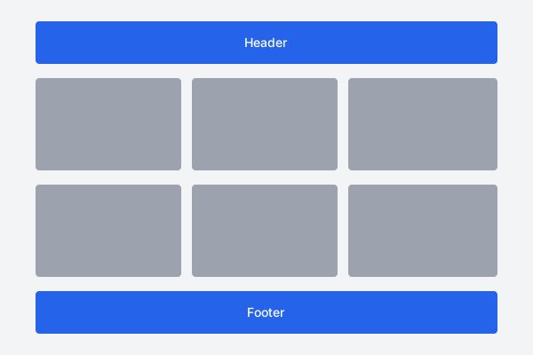
Features:
- CSS Grid-based layout for equal-width columns
- Responsive design that adapts to screen size
- Two breakpoints for tablet and mobile views
- Clean, modular structure for content blocks
- Easy to extend with additional columns or rows
Page Layout Best Practices
- Use semantic HTML5 elements (
<header>,<main>,<footer>) to structure your page - Include proper container elements to control content width
- Implement responsive design with media queries
- Use relative units (%, em, rem) for better responsiveness
- Ensure layouts maintain readability on all device sizes
- Test layouts with different content lengths to ensure they adapt well
- Consider content hierarchy and reading flow in your layout design
Navigation Patterns
Effective navigation is crucial for website usability. Here are several navigation templates for different contexts and device sizes.
Responsive Horizontal Navigation
A classic horizontal navigation bar that transforms into a mobile menu on smaller screens.
<!-- HTML Structure -->
<header class="site-header">
    <div class="container">
        <div class="logo">
            <a href="/">
                <img src="logo.svg" alt="Company Name" width="150" height="50">
            </a>
        </div>

        <button class="nav-toggle" aria-label="Toggle navigation" aria-expanded="false">
            <span class="nav-toggle-bar"></span>
            <span class="nav-toggle-bar"></span>
            <span class="nav-toggle-bar"></span>
        </button>

        <nav class="main-nav">
            <ul class="nav-list">
                <li class="nav-item"><a href="/" class="nav-link active">Home</a></li>
                <li class="nav-item"><a href="/about" class="nav-link">About</a></li>
                <li class="nav-item dropdown">
                    <a href="/services" class="nav-link has-dropdown">Services</a>
                    <ul class="dropdown-menu">
                        <li><a href="/services/web-design">Web Design</a></li>
                        <li><a href="/services/development">Development</a></li>
                        <li><a href="/services/marketing">Marketing</a></li>
                    </ul>
                </li>
                <li class="nav-item"><a href="/portfolio" class="nav-link">Portfolio</a></li>
                <li class="nav-item"><a href="/blog" class="nav-link">Blog</a></li>
                <li class="nav-item"><a href="/contact" class="nav-link">Contact</a></li>
            </ul>
        </nav>
    </div>
</header>

<!-- CSS Styles (place in your stylesheet) -->
<style>
/* Basic styles for the navigation */
.site-header {
    background: #fff;
    box-shadow: 0 2px 10px rgba(0,0,0,0.1);
    position: relative;
    z-index: 100;
}

.container {
    max-width: 1200px;
    margin: 0 auto;
    padding: 0 20px;
    display: flex;
    align-items: center;
    justify-content: space-between;
}

.logo {
    padding: 15px 0;
}

.nav-toggle {
    display: none;
    background: none;
    border: none;
    cursor: pointer;
    padding: 10px;
}

.nav-toggle-bar {
    display: block;
    width: 25px;
    height: 3px;
    background: #333;
    margin: 5px 0;
    transition: all 0.3s ease;
}

.nav-list {
    display: flex;
    list-style: none;
    margin: 0;
    padding: 0;
}

.nav-item {
    position: relative;
}

.nav-link {
    display: block;
    padding: 20px 15px;
    color: #333;
    text-decoration: none;
    transition: color 0.3s ease;
}

.nav-link:hover, .nav-link.active {
    color: #0066cc;
}

.dropdown-menu {
    position: absolute;
    top: 100%;
    left: 0;
    background: #fff;
    box-shadow: 0 2px 10px rgba(0,0,0,0.1);
    min-width: 200px;
    list-style: none;
    padding: 10px 0;
    margin: 0;
    visibility: hidden;
    opacity: 0;
    transform: translateY(10px);
    transition: all 0.3s ease;
    z-index: 100;
}

.dropdown:hover .dropdown-menu {
    visibility: visible;
    opacity: 1;
    transform: translateY(0);
}

.dropdown-menu a {
    display: block;
    padding: 10px 20px;
    color: #333;
    text-decoration: none;
}

.dropdown-menu a:hover {
    background: #f8f8f8;
    color: #0066cc;
}

/* Mobile navigation styles */
@media (max-width: 768px) {
    .nav-toggle {
        display: block;
    }

    .main-nav {
        position: absolute;
        top: 100%;
        left: 0;
        right: 0;
        background: #fff;
        box-shadow: 0 5px 10px rgba(0,0,0,0.1);
        max-height: 0;
        overflow: hidden;
        transition: max-height 0.3s ease;
    }

    .main-nav.active {
        max-height: 500px;
    }

    .nav-list {
        flex-direction: column;
    }

    .nav-link {
        padding: 15px 20px;
        border-bottom: 1px solid #eee;
    }

    .dropdown-menu {
        position: static;
        visibility: visible;
        opacity: 1;
        transform: none;
        box-shadow: none;
        max-height: 0;
        overflow: hidden;
        transition: max-height 0.3s ease;
    }

    .dropdown.active .dropdown-menu {
        max-height: 200px;
    }
}
</style>

<!-- JavaScript for mobile toggle (place before closing body tag) -->
<script>
document.addEventListener('DOMContentLoaded', function() {
    const navToggle = document.querySelector('.nav-toggle');
    const mainNav = document.querySelector('.main-nav');
    const dropdowns = document.querySelectorAll('.dropdown');

    // Toggle mobile menu
    navToggle.addEventListener('click', function() {
        mainNav.classList.toggle('active');
        const isExpanded = mainNav.classList.contains('active');
        navToggle.setAttribute('aria-expanded', isExpanded);
    });

    // Handle dropdown menus on mobile
    dropdowns.forEach(dropdown => {
        const link = dropdown.querySelector('.has-dropdown');

        link.addEventListener('click', function(e) {
            if (window.innerWidth <= 768) {
                e.preventDefault();
                dropdown.classList.toggle('active');
            }
        });
    });
});
</script>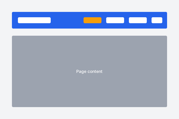
Features:
- Responsive design that adapts to mobile screens
- Dropdown support for nested navigation
- Accessible with ARIA attributes and keyboard support
- Smooth transitions and animations
- Clean, semantic HTML structure
Vertical Sidebar Navigation
A vertical navigation menu ideal for dashboards, documentation sites, or any page with extensive navigation needs.
<!-- HTML Structure -->
<div class="page-container">
    <aside class="sidebar">
        <div class="sidebar-header">
            <h2>Site Name</h2>
            <button class="sidebar-close" aria-label="Close sidebar">×</button>
        </div>

        <nav class="sidebar-nav">
            <ul class="sidebar-menu">
                <li class="sidebar-item">
                    <a href="/" class="sidebar-link active">
                        <span class="sidebar-icon">🏠</span>
                        <span class="sidebar-text">Dashboard</span>
                    </a>
                </li>
                <li class="sidebar-item">
                    <a href="/users" class="sidebar-link">
                        <span class="sidebar-icon">👤</span>
                        <span class="sidebar-text">Users</span>
                    </a>
                </li>
                <li class="sidebar-item has-submenu">
                    <a href="#" class="sidebar-link sidebar-submenu-toggle">
                        <span class="sidebar-icon">📊</span>
                        <span class="sidebar-text">Reports</span>
                        <span class="submenu-arrow">▾</span>
                    </a>
                    <ul class="sidebar-submenu">
                        <li><a href="/reports/daily">Daily Reports</a></li>
                        <li><a href="/reports/weekly">Weekly Reports</a></li>
                        <li><a href="/reports/monthly">Monthly Reports</a></li>
                    </ul>
                </li>
                <li class="sidebar-item">
                    <a href="/settings" class="sidebar-link">
                        <span class="sidebar-icon">⚙️</span>
                        <span class="sidebar-text">Settings</span>
                    </a>
                </li>
                <li class="sidebar-item">
                    <a href="/help" class="sidebar-link">
                        <span class="sidebar-icon">❓</span>
                        <span class="sidebar-text">Help & Support</span>
                    </a>
                </li>
            </ul>
        </nav>

        <div class="sidebar-footer">
            <a href="/logout" class="sidebar-link">
                <span class="sidebar-icon">🚪</span>
                <span class="sidebar-text">Logout</span>
            </a>
        </div>
    </aside>

    <main class="main-content">
        <header class="main-header">
            <button class="sidebar-toggle" aria-label="Toggle sidebar">
                <span></span>
                <span></span>
                <span></span>
            </button>
            <h1>Dashboard</h1>
        </header>

        <div class="content">
            <!-- Main page content goes here -->
            <p>This is the main content area.</p>
        </div>
    </main>
</div>

<!-- CSS Styles (place in your stylesheet) -->
<style>
/* Base styles */
* {
    box-sizing: border-box;
}

body {
    margin: 0;
    font-family: Arial, sans-serif;
    color: #333;
}

/* Page container */
.page-container {
    display: flex;
    min-height: 100vh;
}

/* Sidebar styles */
.sidebar {
    width: 250px;
    background: #2c3e50;
    color: #ecf0f1;
    display: flex;
    flex-direction: column;
    transition: all 0.3s ease;
}

.sidebar-header {
    padding: 20px;
    display: flex;
    justify-content: space-between;
    align-items: center;
    border-bottom: 1px solid rgba(255,255,255,0.1);
}

.sidebar-header h2 {
    margin: 0;
    font-size: 1.25rem;
}

.sidebar-close {
    display: none;
    background: none;
    border: none;
    color: #ecf0f1;
    font-size: 1.5rem;
    cursor: pointer;
}

.sidebar-nav {
    flex: 1;
    padding: 20px 0;
    overflow-y: auto;
}

.sidebar-menu {
    list-style: none;
    padding: 0;
    margin: 0;
}

.sidebar-item {
    margin-bottom: 5px;
}

.sidebar-link {
    display: flex;
    align-items: center;
    padding: 12px 20px;
    color: #ecf0f1;
    text-decoration: none;
    transition: all 0.2s ease;
}

.sidebar-link:hover, .sidebar-link.active {
    background: rgba(255,255,255,0.1);
}

.sidebar-icon {
    margin-right: 10px;
    font-size: 1.1rem;
}

.submenu-arrow {
    margin-left: auto;
    transition: transform 0.3s ease;
}

.sidebar-submenu {
    max-height: 0;
    overflow: hidden;
    list-style: none;
    padding: 0;
    margin: 0;
    background: rgba(0,0,0,0.1);
    transition: max-height 0.3s ease;
}

.sidebar-item.active .sidebar-submenu {
    max-height: 500px;
}

.sidebar-item.active .submenu-arrow {
    transform: rotate(180deg);
}

.sidebar-submenu a {
    display: block;
    padding: 10px 20px 10px 46px;
    color: #ecf0f1;
    text-decoration: none;
    transition: background 0.2s ease;
}

.sidebar-submenu a:hover {
    background: rgba(255,255,255,0.05);
}

.sidebar-footer {
    padding: 20px;
    border-top: 1px solid rgba(255,255,255,0.1);
}

/* Main content area */
.main-content {
    flex: 1;
    background: #f8f9fa;
}

.main-header {
    display: flex;
    align-items: center;
    padding: 15px 20px;
    background: #fff;
    box-shadow: 0 2px 5px rgba(0,0,0,0.1);
}

.sidebar-toggle {
    display: none;
    background: none;
    border: none;
    cursor: pointer;
    margin-right: 15px;
    padding: 5px;
}

.sidebar-toggle span {
    display: block;
    width: 25px;
    height: 3px;
    background: #333;
    margin: 5px 0;
    transition: all 0.3s ease;
}

.main-header h1 {
    margin: 0;
    font-size: 1.5rem;
}

.content {
    padding: 20px;
}

/* Responsive styles */
@media (max-width: 768px) {
    .sidebar {
        position: fixed;
        left: -250px;
        top: 0;
        bottom: 0;
        z-index: 1000;
        box-shadow: 5px 0 15px rgba(0,0,0,0.1);
    }

    .sidebar.active {
        left: 0;
    }

    .sidebar-close {
        display: block;
    }

    .sidebar-toggle {
        display: block;
    }

    .page-container.sidebar-open .main-content {
        filter: blur(3px);
    }
}
</style>

<!-- JavaScript for sidebar functionality (place before closing body tag) -->
<script>
document.addEventListener('DOMContentLoaded', function() {
    const sidebarToggle = document.querySelector('.sidebar-toggle');
    const sidebarClose = document.querySelector('.sidebar-close');
    const sidebar = document.querySelector('.sidebar');
    const pageContainer = document.querySelector('.page-container');
    const submenuToggles = document.querySelectorAll('.sidebar-submenu-toggle');

    // Toggle sidebar on mobile
    sidebarToggle.addEventListener('click', function() {
        sidebar.classList.toggle('active');
        pageContainer.classList.toggle('sidebar-open');
    });

    // Close sidebar on mobile
    sidebarClose.addEventListener('click', function() {
        sidebar.classList.remove('active');
        pageContainer.classList.remove('sidebar-open');
    });

    // Toggle submenus
    submenuToggles.forEach(toggle => {
        toggle.addEventListener('click', function(e) {
            e.preventDefault();
            const parent = this.closest('.sidebar-item');
            parent.classList.toggle('active');
        });
    });
});
</script>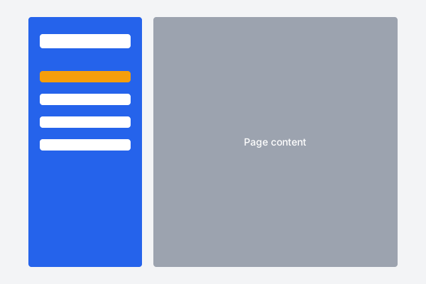
Features:
- Collapsible sidebar navigation for mobile devices
- Expandable submenu support for nested navigation
- Icon support for visual cues
- Footer area for important actions like logout
- Responsive design that adapts to different screen sizes
Breadcrumb Navigation
Breadcrumb trails help users understand their location in a website's hierarchy and navigate back to previous levels.
<!-- Simple Breadcrumbs -->
<nav aria-label="Breadcrumb" class="breadcrumbs">
    <ol>
        <li><a href="/">Home</a></li>
        <li><a href="/products">Products</a></li>
        <li><a href="/products/electronics">Electronics</a></li>
        <li><span aria-current="page">Smartphones</span></li>
    </ol>
</nav>

<!-- Breadcrumbs with Schema.org markup for SEO -->
<nav aria-label="Breadcrumb" class="breadcrumbs">
    <ol itemscope itemtype="https://schema.org/BreadcrumbList">
        <li itemprop="itemListElement" itemscope itemtype="https://schema.org/ListItem">
            <a href="/" itemprop="item">
                <span itemprop="name">Home</span>
            </a>
            <meta itemprop="position" content="1" />
        </li>
        <li itemprop="itemListElement" itemscope itemtype="https://schema.org/ListItem">
            <a href="/products" itemprop="item">
                <span itemprop="name">Products</span>
            </a>
            <meta itemprop="position" content="2" />
        </li>
        <li itemprop="itemListElement" itemscope itemtype="https://schema.org/ListItem">
            <a href="/products/electronics" itemprop="item">
                <span itemprop="name">Electronics</span>
            </a>
            <meta itemprop="position" content="3" />
        </li>
        <li itemprop="itemListElement" itemscope itemtype="https://schema.org/ListItem" aria-current="page">
            <span itemprop="name">Smartphones</span>
            <meta itemprop="position" content="4" />
        </li>
    </ol>
</nav>

<!-- CSS Styles -->
<style>
.breadcrumbs {
    padding: 10px 0;
    margin-bottom: 20px;
}

.breadcrumbs ol {
    list-style: none;
    padding: 0;
    margin: 0;
    display: flex;
    flex-wrap: wrap;
}

.breadcrumbs li {
    display: inline-flex;
    align-items: center;
}

.breadcrumbs li:not(:last-child)::after {
    content: "›";
    margin: 0 10px;
    color: #666;
}

.breadcrumbs a {
    color: #0066cc;
    text-decoration: none;
}

.breadcrumbs a:hover {
    text-decoration: underline;
}

.breadcrumbs [aria-current="page"] {
    color: #666;
    font-weight: 500;
}

/* Responsive adjustments */
@media (max-width: 576px) {
    .breadcrumbs {
        font-size: 0.875rem;
    }

    .breadcrumbs li:not(:last-child)::after {
        margin: 0 5px;
    }
}
</style>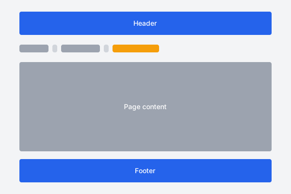
Features:
- Semantic HTML using ordered list structure
- Accessible with appropriate ARIA attributes
- Schema.org markup for SEO benefits
- Responsive design that works on mobile
- Clear visual separation between levels
Navigation Best Practices
- Use semantic HTML elements like
<nav>and<ul>for navigation - Include ARIA attributes for accessibility (
aria-current,aria-expanded, etc.) - Ensure all navigation is keyboard accessible
- Provide clear visual indication for active and hover states
- Keep mobile navigation usable with touch-friendly tap targets
- Consider using breadcrumbs for deep site hierarchies
- Test navigation on different devices and screen sizes
- Limit the number of main navigation items (7±2 is a good rule)
Hero and Header Sections
The hero is the first block of a page: a headline, a sentence of support and one clear action. Both templates below are responsive without needing a stack of breakpoints — the first uses no media query at all.
Centred Hero Section
A single-column hero that works at every width. clamp() scales the heading between a minimum and maximum size as the viewport grows, which removes the need for typography breakpoints entirely.
<!-- Centred hero: the safest default. Works from 320px up
     with no media query, because the layout is a single column. -->
<section class="hero">
  <div class="hero__inner">
    <h1>Build faster with clean HTML</h1>
    <p class="hero__lead">
      A short sentence that says what this page is for. Keep it under
      about 25 words — a hero is a promise, not a paragraph.
    </p>
    <div class="hero__actions">
      <a class="btn btn--primary" href="/signup">Get started</a>
      <a class="btn btn--ghost" href="/tour">Take the tour</a>
    </div>
  </div>
</section>

<style>
  .hero {
    background: #f3f4f6;
    padding: clamp(2rem, 8vw, 6rem) 1rem;
    text-align: center;
  }
  .hero__inner { max-width: 60ch; margin: 0 auto; }

  /* clamp() scales the heading with the viewport, so no
     media query is needed for typography. */
  .hero h1 {
    font-size: clamp(1.75rem, 5vw, 3.25rem);
    line-height: 1.15;
    margin: 0 0 1rem;
  }
  .hero__lead {
    font-size: clamp(1rem, 2.5vw, 1.25rem);
    color: #4b5563;
    margin: 0 0 2rem;
  }
  .hero__actions {
    display: flex;
    flex-wrap: wrap;
    gap: .75rem;
    justify-content: center;
  }
  .btn {
    display: inline-block;
    padding: .75rem 1.5rem;
    border-radius: 6px;
    text-decoration: none;
    font-weight: 600;
  }
  .btn--primary { background: #2563eb; color: #fff; }
  .btn--ghost   { background: #fff; color: #1f2937; border: 1px solid #d1d5db; }
</style>
Features:
- Readable at 320px with no media query
- Fluid typography via
clamp() - Buttons wrap instead of overflowing on narrow screens
- Content capped at 60ch for comfortable line length
Split Hero with Image
Text and image side by side on wide screens, stacked on narrow ones. The single min-width breakpoint is the only place the layout changes.
<!-- Split hero: text beside an image on wide screens,
     stacked on narrow ones. One breakpoint does the whole job. -->
<section class="split-hero">
  <div class="split-hero__text">
    <h1>Everything you need, nothing you don't</h1>
    <p>
      Explain the offer in one or two sentences, then give exactly one
      primary action.
    </p>
    <a class="btn btn--primary" href="/start">Start free</a>
  </div>

  <figure class="split-hero__media">
    <img src="screenshot.webp"
         alt="The dashboard showing this month's totals"
         width="800" height="600" loading="eager" decoding="async">
  </figure>
</section>

<style>
  .split-hero {
    display: grid;
    gap: 2rem;
    align-items: center;
    padding: clamp(1.5rem, 5vw, 4rem);
    max-width: 1100px;
    margin: 0 auto;
  }
  .split-hero h1 {
    font-size: clamp(1.75rem, 4vw, 3rem);
    line-height: 1.15;
  }
  .split-hero__media { margin: 0; }
  .split-hero img {
    width: 100%;
    height: auto;       /* keeps the aspect ratio */
    border-radius: 8px;
  }

  /* Two columns only when there is room for them. */
  @media (min-width: 48em) {
    .split-hero { grid-template-columns: 1fr 1fr; gap: 3rem; }
  }
</style>
Features:
- Mobile-first: one column is the default, two is the enhancement
widthandheighton the image reserve space and prevent layout shiftheight: autokeeps the aspect ratio as the image scalesloading="eager"because a hero image is above the fold
One action, not four
A hero with five links has no call to action. Pick the one thing you want a visitor to do, make that the primary button, and let everything else be a secondary link.
Complete Starter Website Template
If you want one file to start from rather than a pattern to graft in, this is it: a full HTML page with a header, hero, content grid and footer, plus the stylesheet it references. Copy both, change the text, and you have a working site.
The page: index.html
Save this as index.html. The header and footer are the parts you repeat on every page; only what is inside <main> changes.
<!DOCTYPE html>
<html lang="en">
<head>
<meta charset="UTF-8">
<meta name="viewport" content="width=device-width, initial-scale=1.0">
<title>Home — Your Site Name</title>
<meta name="description" content="One sentence describing this page, 150 characters or so.">
<link rel="stylesheet" href="css/style.css">
</head>
<body>
<a class="skip-link" href="#main">Skip to main content</a>
<!-- ===== Header: identical on every page ===== -->
<header class="site-header">
<div class="container">
<a class="logo" href="/">Your Site Name</a>
<nav aria-label="Main">
<ul class="nav">
<li><a href="/" aria-current="page">Home</a></li>
<li><a href="/about">About</a></li>
<li><a href="/services">Services</a></li>
<li><a href="/contact">Contact</a></li>
</ul>
</nav>
</div>
</header>
<!-- ===== Main: the only part that changes per page ===== -->
<main id="main">
<section class="hero">
<div class="container">
<h1>Your headline goes here</h1>
<p>A short supporting sentence.</p>
<a class="btn" href="/contact">Get in touch</a>
</div>
</section>
<section class="features">
<div class="container">
<h2>What we do</h2>
<div class="grid">
<article>
<h3>First thing</h3>
<p>A sentence or two about it.</p>
</article>
<article>
<h3>Second thing</h3>
<p>A sentence or two about it.</p>
</article>
<article>
<h3>Third thing</h3>
<p>A sentence or two about it.</p>
</article>
</div>
</div>
</section>
</main>
<!-- ===== Footer: identical on every page ===== -->
<footer class="site-footer">
<div class="container">
<p>© 2026 Your Site Name</p>
<ul class="nav">
<li><a href="/privacy">Privacy</a></li>
<li><a href="/terms">Terms</a></li>
</ul>
</div>
</footer>
</body>
</html>Features:
- Valid HTML5 with the four head tags every page needs
- Semantic
header,nav,mainandfooter - Skip link for keyboard users
aria-current="page"marks the active nav item- No framework, no build step, no JavaScript
The stylesheet: css/style.css
Save this as css/style.css, in a css folder next to your HTML. Every page in the site links to this one file, so a change here updates the whole site.
/* css/style.css — one stylesheet shared by every page. */

*, *::before, *::after { box-sizing: border-box; margin: 0; padding: 0; }

body {
  font-family: system-ui, -apple-system, "Segoe UI", Roboto, sans-serif;
  line-height: 1.6;
  color: #1f2937;
}

.container {
  width: 100%;
  max-width: 1100px;
  margin: 0 auto;
  padding: 0 1rem;
}

.skip-link {
  position: absolute; left: 1rem; top: -3rem;
  background: #2563eb; color: #fff;
  padding: .5rem 1rem; border-radius: 4px;
  transition: top .15s;
}
.skip-link:focus { top: 1rem; }

/* Header ------------------------------------------------------------ */
.site-header { border-bottom: 1px solid #e5e7eb; padding: 1rem 0; }
.site-header .container {
  display: flex; flex-wrap: wrap; gap: 1rem;
  align-items: center; justify-content: space-between;
}
.logo { font-weight: 700; font-size: 1.25rem; color: inherit; text-decoration: none; }

.nav { display: flex; flex-wrap: wrap; gap: 1rem; list-style: none; }
.nav a { color: #2563eb; text-decoration: none; }
.nav a:hover, .nav a:focus { text-decoration: underline; }
.nav a[aria-current="page"] { color: #1f2937; font-weight: 600; }

/* Sections ---------------------------------------------------------- */
.hero { background: #f3f4f6; padding: clamp(2rem, 7vw, 5rem) 0; text-align: center; }
.hero h1 { font-size: clamp(1.75rem, 5vw, 3rem); margin-bottom: .5rem; }
.hero p  { margin-bottom: 1.5rem; }

.btn {
  display: inline-block; background: #2563eb; color: #fff;
  padding: .75rem 1.5rem; border-radius: 6px;
  text-decoration: none; font-weight: 600;
}

.features { padding: clamp(2rem, 6vw, 4rem) 0; }
.features h2 { margin-bottom: 1.5rem; }

/* auto-fit means the grid decides the column count, so this one line
   replaces every breakpoint you would otherwise write for it. */
.grid {
  display: grid;
  grid-template-columns: repeat(auto-fit, minmax(min(100%, 260px), 1fr));
  gap: 1.5rem;
}
.grid article { border: 1px solid #e5e7eb; border-radius: 8px; padding: 1.25rem; }

/* Footer ------------------------------------------------------------ */
.site-footer { border-top: 1px solid #e5e7eb; margin-top: 3rem; padding: 1.5rem 0; }
.site-footer .container {
  display: flex; flex-wrap: wrap; gap: 1rem;
  align-items: center; justify-content: space-between;
}
Features:
- Responsive with a single
auto-fitgrid and no fixed breakpoints - Fluid spacing and type via
clamp() - Flex headers and footers that wrap rather than overflow
- Roughly 70 lines — small enough to read and change
Turning it into a multi-page site
To add a second page, copy index.html, rename it
(about.html), and change three things: the
<title>, the meta description, and everything
inside <main>. Move
aria-current="page" onto that page's nav link. The
header, footer and stylesheet stay identical.
Plain HTML has no include mechanism, so the header and footer are genuinely duplicated in each file. For a handful of pages that is fine and it keeps the site deployable anywhere. Past roughly ten pages, a static site generator that does the includes for you will save more time than it costs to learn.
File and folder layout
my-site/
  index.html
  about.html
  contact.html
  css/
    style.css
  images/
    logo.svg
Open index.html straight from disk in a browser —
no server needed. See it running on our
HTML demo page, or paste it into the
live editor to experiment.
Template Performance Considerations
Optimizing HTML templates for performance is essential for creating a fast, smooth user experience. Here are key considerations when implementing templates.
HTML Performance Optimization
- Minimize HTML Size - Remove unnecessary whitespace, comments, and redundant markup
- Avoid Excessive DOM Nesting - Keep DOM trees shallow to improve rendering performance
- Use Semantic Elements - They're often more efficient for browsers to render
- Lazy Load Resources - Use
loading="lazy"for images and iframes below the fold - Optimize Images - Use appropriate image formats and sizes with responsive images
- External Resources - Minimize external CSS and JavaScript files
CSS Performance Tips
- Simplify Selectors - Avoid deeply nested selectors and excessive specificity
- Use CSS Efficiently - Group similar styles and avoid redundant declarations
- Consider Critical CSS - Inline critical styles for above-the-fold content
- Use CSS Variables - For more maintainable and efficient code
JavaScript Performance Tips
- Defer Non-Critical JavaScript - Use
deferorasyncattributes - Minimize DOM Manipulations - Batch updates and use document fragments
- Delegate Event Listeners - Use event delegation instead of multiple listeners
- Debounce and Throttle - For scroll, resize, and other frequently firing events
Performance-Optimized Template Example
<!DOCTYPE html>
<html lang="en">
<head>
    <meta charset="UTF-8">
    <meta name="viewport" content="width=device-width, initial-scale=1.0">
    <title>Performance-Optimized Page</title>

    <!-- Preconnect to external domains -->
    <link rel="preconnect" href="https://fonts.googleapis.com">
    <link rel="preconnect" href="https://fonts.gstatic.com" crossorigin>

    <!-- Critical CSS inlined for faster rendering -->
    <style>
        /* Critical CSS for above-the-fold content */
        :root {
            --text-color: #333;
            --bg-color: #fff;
            --accent-color: #0066cc;
        }
        body {
            font-family: system-ui, -apple-system, BlinkMacSystemFont, 'Segoe UI', Roboto, Oxygen, Ubuntu, Cantarell, sans-serif;
            line-height: 1.6;
            color: var(--text-color);
            background: var(--bg-color);
            margin: 0;
        }
        .container {
            width: 100%;
            max-width: 1200px;
            margin: 0 auto;
            padding: 0 20px;
        }
        header {
            padding: 1rem 0;
        }
        .hero {
            padding: 3rem 0;
            text-align: center;
        }
        h1 {
            margin-top: 0;
        }
    </style>

    <!-- Non-critical CSS loaded asynchronously -->
    <link rel="preload" href="styles.css" as="style" onload="this.onload=null;this.rel='stylesheet'">
    <noscript><link rel="stylesheet" href="styles.css"></noscript>

    <!-- Fonts loaded with display=swap -->
    <link href="https://fonts.googleapis.com/css2?family=Open+Sans:wght@400;600&display=swap" rel="stylesheet">
</head>
<body>
    <header>
        <div class="container">
            <nav>
                <a href="/">Home</a>
                <a href="/about">About</a>
                <a href="/services">Services</a>
                <a href="/contact">Contact</a>
            </nav>
        </div>
    </header>

    <main>
        <section class="hero">
            <div class="container">
                <h1>Performance-Optimized Template</h1>
                <p>A template designed with performance best practices in mind.</p>
            </div>
        </section>

        <section class="features">
            <div class="container">
                <h2>Key Features</h2>
                <div class="feature-grid">
                    <div class="feature">
                        <h3>Fast Loading</h3>
                        <p>Optimized for speed with minimal bloat.</p>
                    </div>
                    <div class="feature">
                        <h3>Responsive Design</h3>
                        <p>Looks great on all devices.</p>
                    </div>
                    <div class="feature">
                        <h3>Accessibility</h3>
                        <p>Built with inclusivity in mind.</p>
                    </div>
                </div>
            </div>
        </section>

        <section class="content">
            <div class="container">
                <h2>Main Content</h2>
                <p>Lorem ipsum dolor sit amet, consectetur adipiscing elit. Vivamus lacinia odio vitae vestibulum vestibulum.</p>

                <!-- Lazy-loaded image below the fold -->
                <img src="image.jpg" alt="Description" width="800" height="500" loading="lazy">
            </div>
        </section>
    </main>

    <footer>
        <div class="container">
            <p>© 2023 Your Company. All rights reserved.</p>
        </div>
    </footer>

    <!-- JavaScript loaded at the end with defer -->
    <script src="main.js" defer></script>
</body>
</html>
Performance Features:
- Inlined critical CSS for faster rendering
- Asynchronous loading of non-critical CSS
- Preconnect hints for external domains
- System font stack with web font fallback
- Lazy loading for below-the-fold images
- Deferred JavaScript loading
- CSS variables for efficient styling
- Semantic HTML structure
Performance Testing Tools
- Lighthouse - Built into Chrome DevTools for comprehensive performance audits
- WebPageTest - Detailed performance analysis from multiple locations
- PageSpeed Insights - Google's tool for performance analysis and recommendations
- Chrome DevTools - Network, Performance, and Coverage panels
- GTmetrix - Combined analysis using Lighthouse and PageSpeed
Conclusion and Next Steps
HTML templates provide a solid foundation for building websites and web applications efficiently. By using these templates as starting points, you can save development time, maintain consistency, and focus on customizing for your specific needs.
Remember that templates are just starting points. The best practice is to take what you need, understand how it works, and adapt it to your project's requirements. Always consider performance, accessibility, and maintainability when implementing templates in your projects.